Workflows
Improving the usability of an automation tool
Overview
Workflows is an automation tool, that allows users to build flows that generate tasks and
complete processes automatically without user intervention. It was designed to integrate
with Forms, Code Engine, and Task Center.
Unlike the projects mentioned above, this product already existed when I joined the team. My
role was to pick up where my predecessor had left off, and provide ongoing support for
further product development.
Year:
2023
My Role
Throughout the project, I suggested design changes to improve the usability and presentation
of Workflows. I also worked to re-align Workflows with design patterns and established UI
styles. Starting off, I worked closely with dev leads and design team members to
learn more about the history of the product and how to use it. From there, I suggested
design revision for over 8 task detail panels including user task, email task, timer events,
conditional logic steps, and start and end steps. I also designed and prototyped new
navigation, and for features including connecting orphaned shapes, and adding new shapes to
the canvas.
Throughout my time on this product I’ve also designed and prototyped for validation, and
test run processes. I also designed improvements for the template library, workflow
triggers, and workflow versioning.
The following documentation focuses on the re-design of the detail panel, improvements to the navigation, and creation of in-product help content.
Becoming familiar with the product
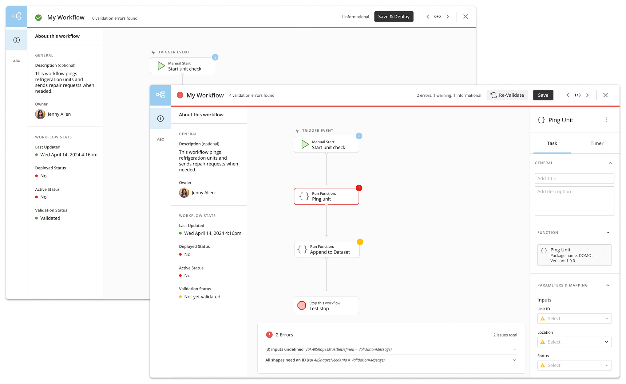
Designing a validation process was the first thing I worked on. This allowed me to start
becoming familiar with the product and the technicalities required for successful
validation. It required that I begin to understand input and output parameters, variables,
mapping and concepts like code packages and functions.
Designing a validation mode for workflows also made me aware of the many bandaid solutions
that had been applieed to the product. There had been so much functionality added over time,
there was a very high learning curve required for beginner users.
Finding room for improvement
As I continued working to improve the product, I began recognizing design pattern
inconsistencies. The organization and presentation of information was also often confusing
and certain functionality that you’d expect to behave similarly, actually behaved very
differently. It was also full of advanced features and technical language that was
intimidating for users trying to put together simple flows.
In my spare time, I began compiling mocks for improvements that I felt would better the user
experience. I reviewed these plans with my manager and other designers, who were also aware
of the need for improvements. Once development time freed up, I presented the concepts to my
dev team. They also reconginzed the need for better usability and were ready to implement
some of the proposed changed. From there, I began designing my mocks in more detail to
prepare for development.
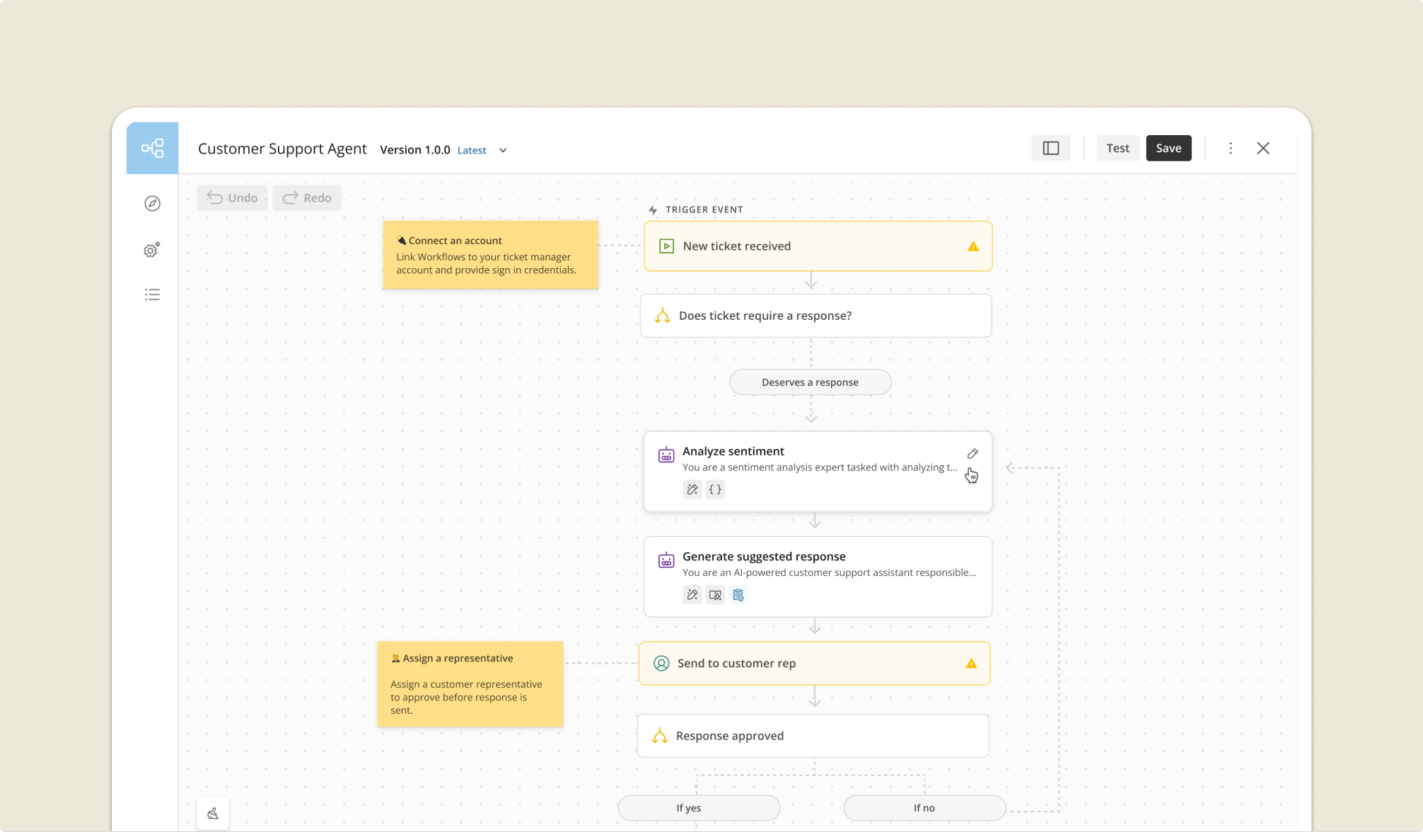
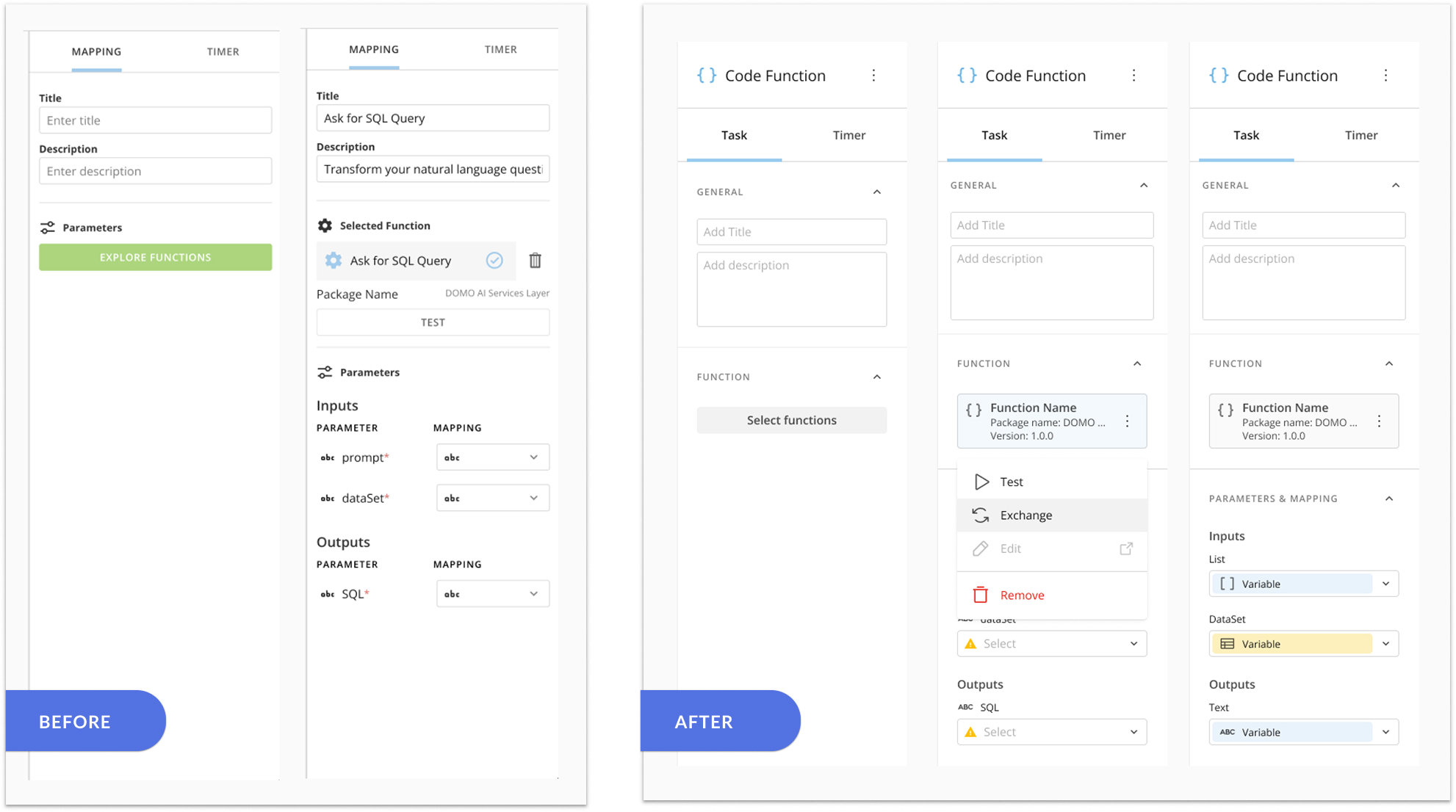
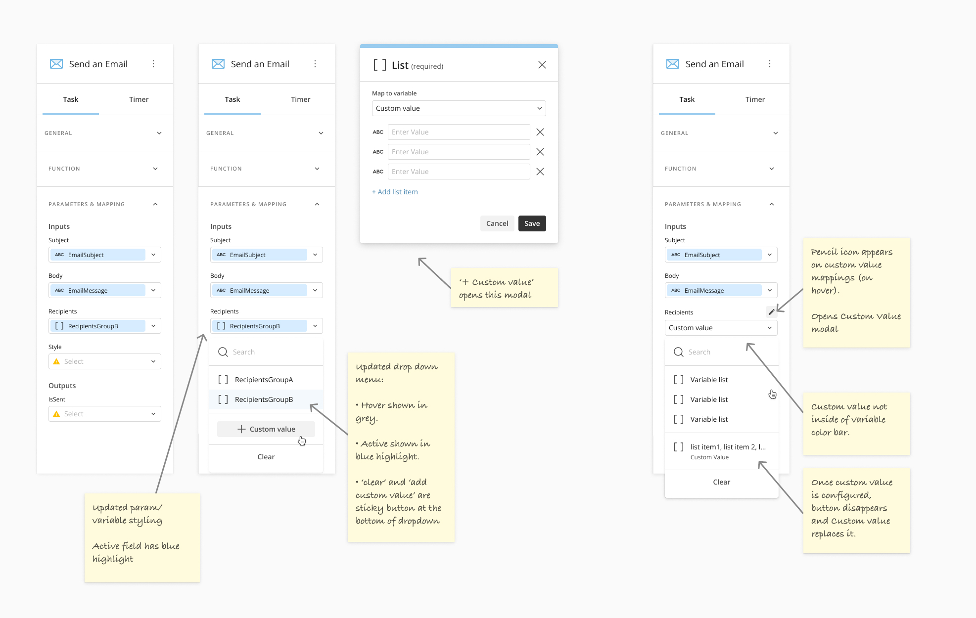
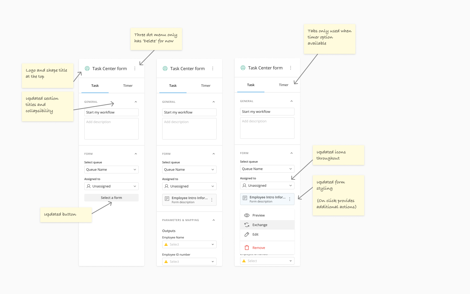
The Detail Panel
Working with the dev lead, we decided to split the changes into three sections that would be
accomplished over the space of several months.
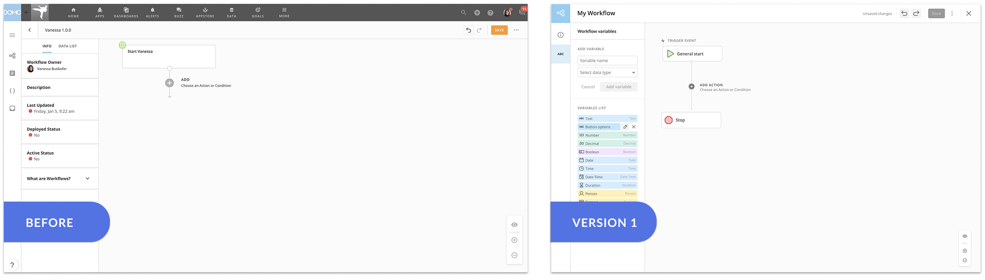
The first of these section was improving the product visually. This included
re-designing how the steps were shown on the canvas, new detail panels for each shape, and
updating the interface to use the most current UX design system. For the detail panel this
meant new collapsable sections, indicating what features of each shape were advanced and
which were required, and establishing a better hierarchy. This also included converting the
interface to a full screen experience, introducing prompt text in the canvas, and minimizing
overly technical language.
Configuring general action
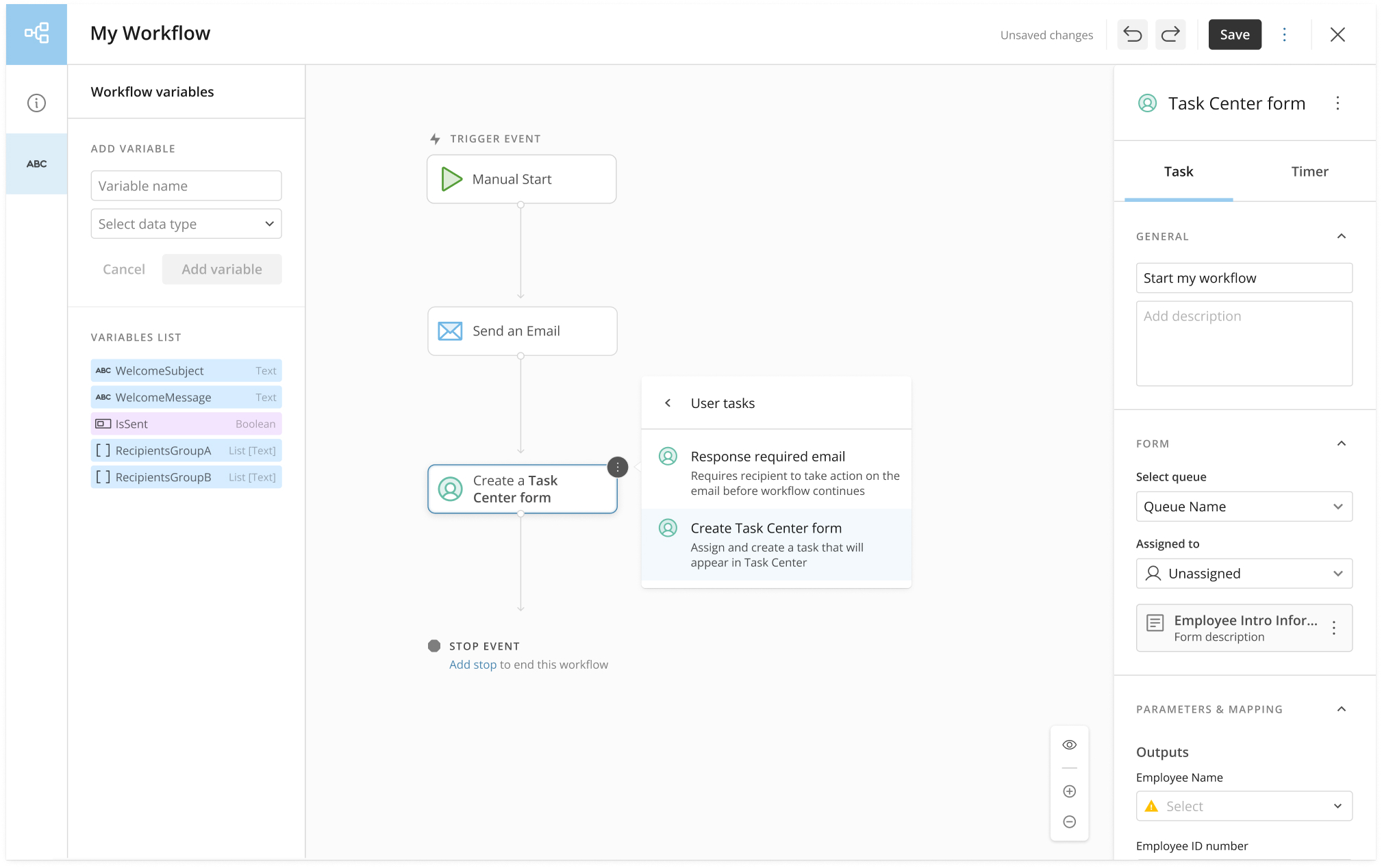
Configuring a task for Task Center
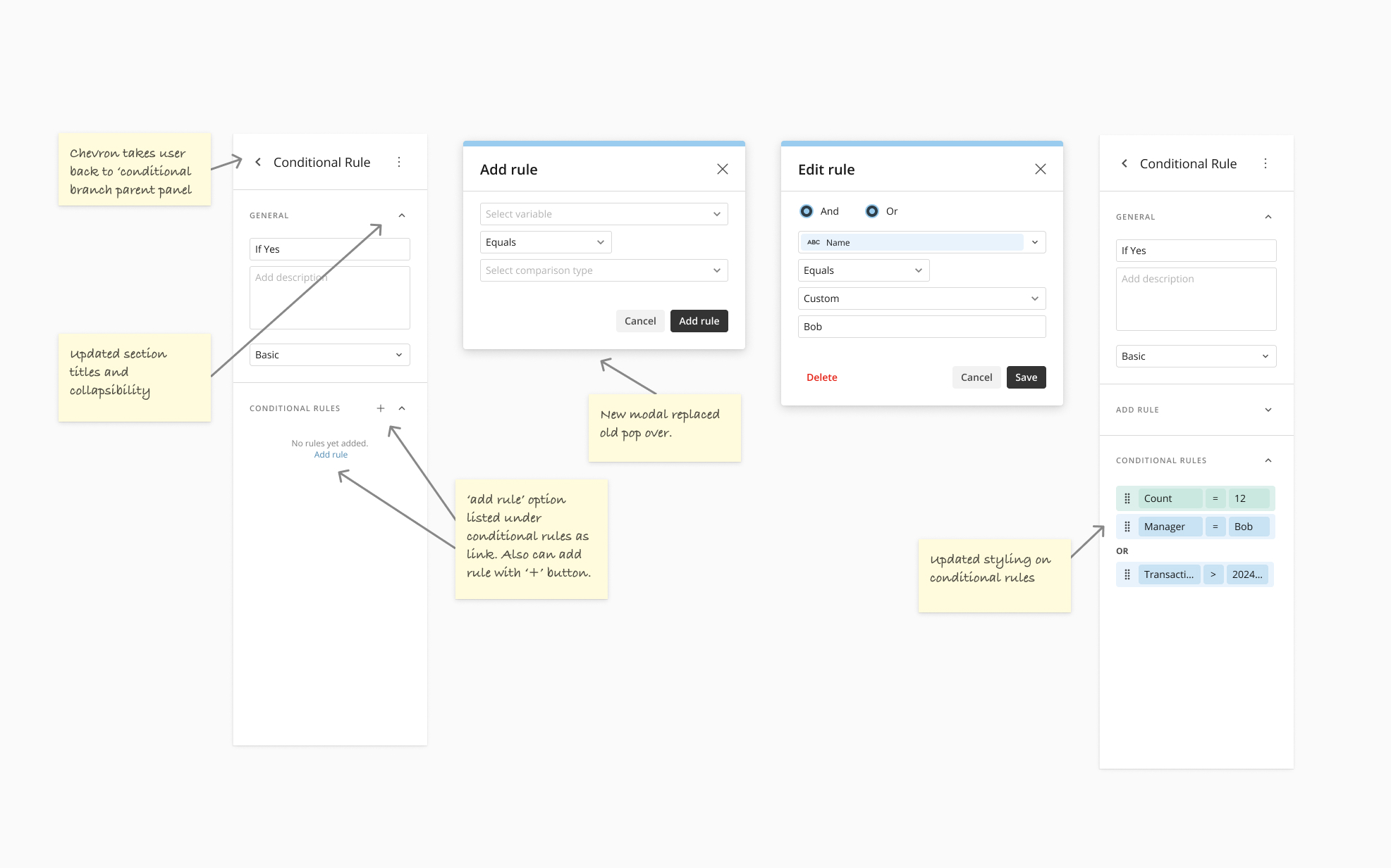
Configuring conditional logic
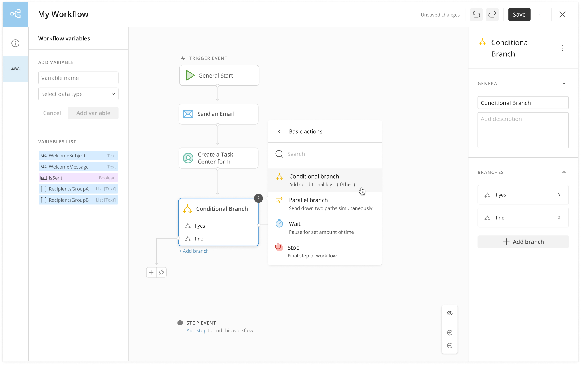
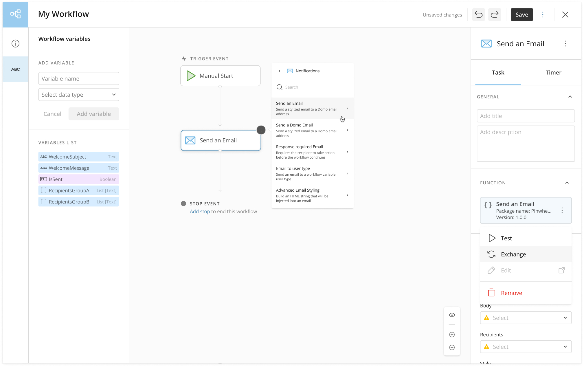
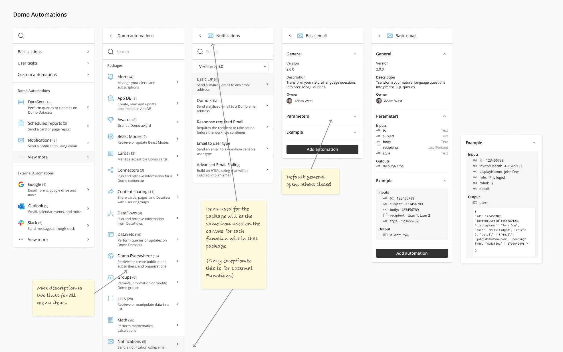
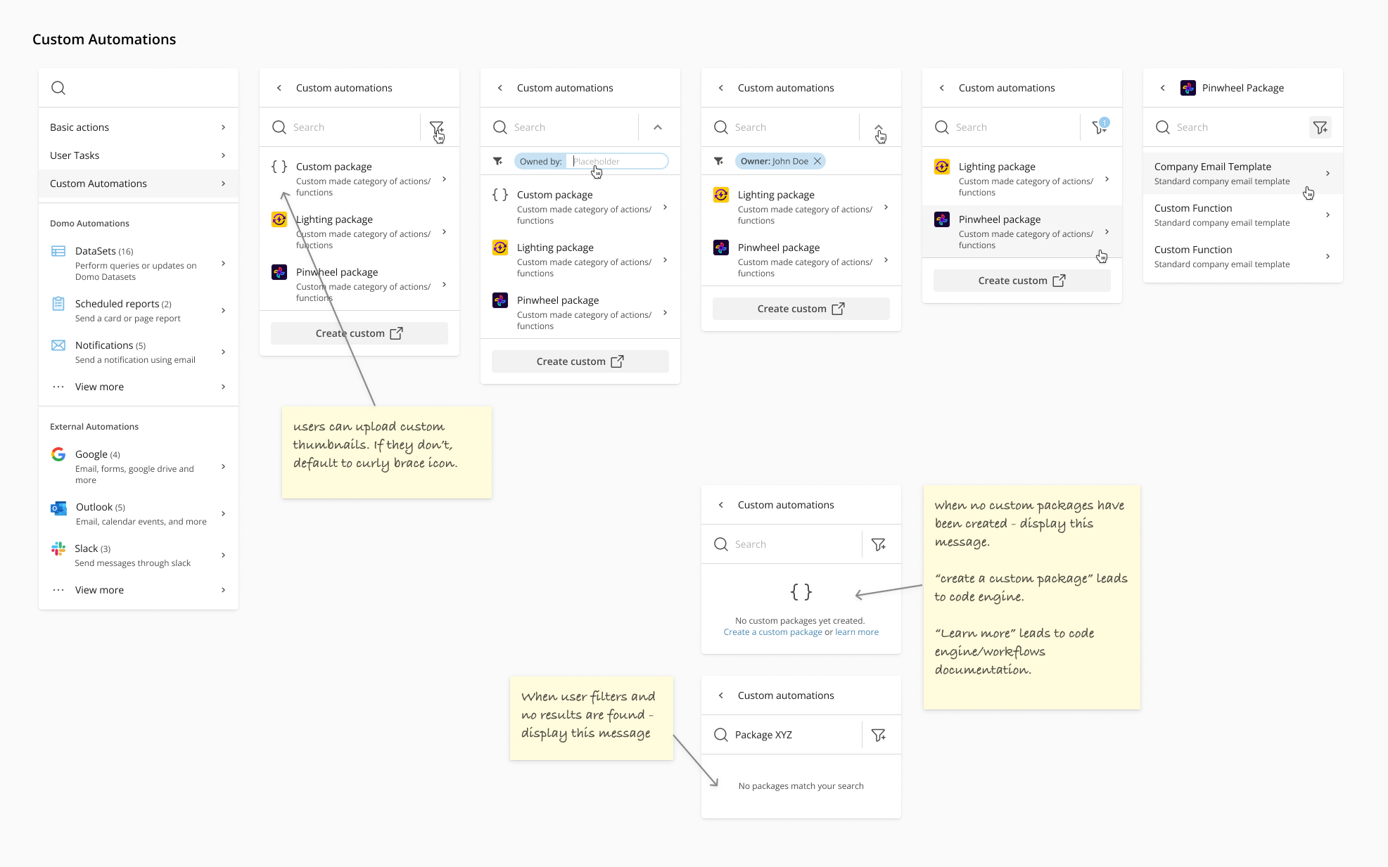
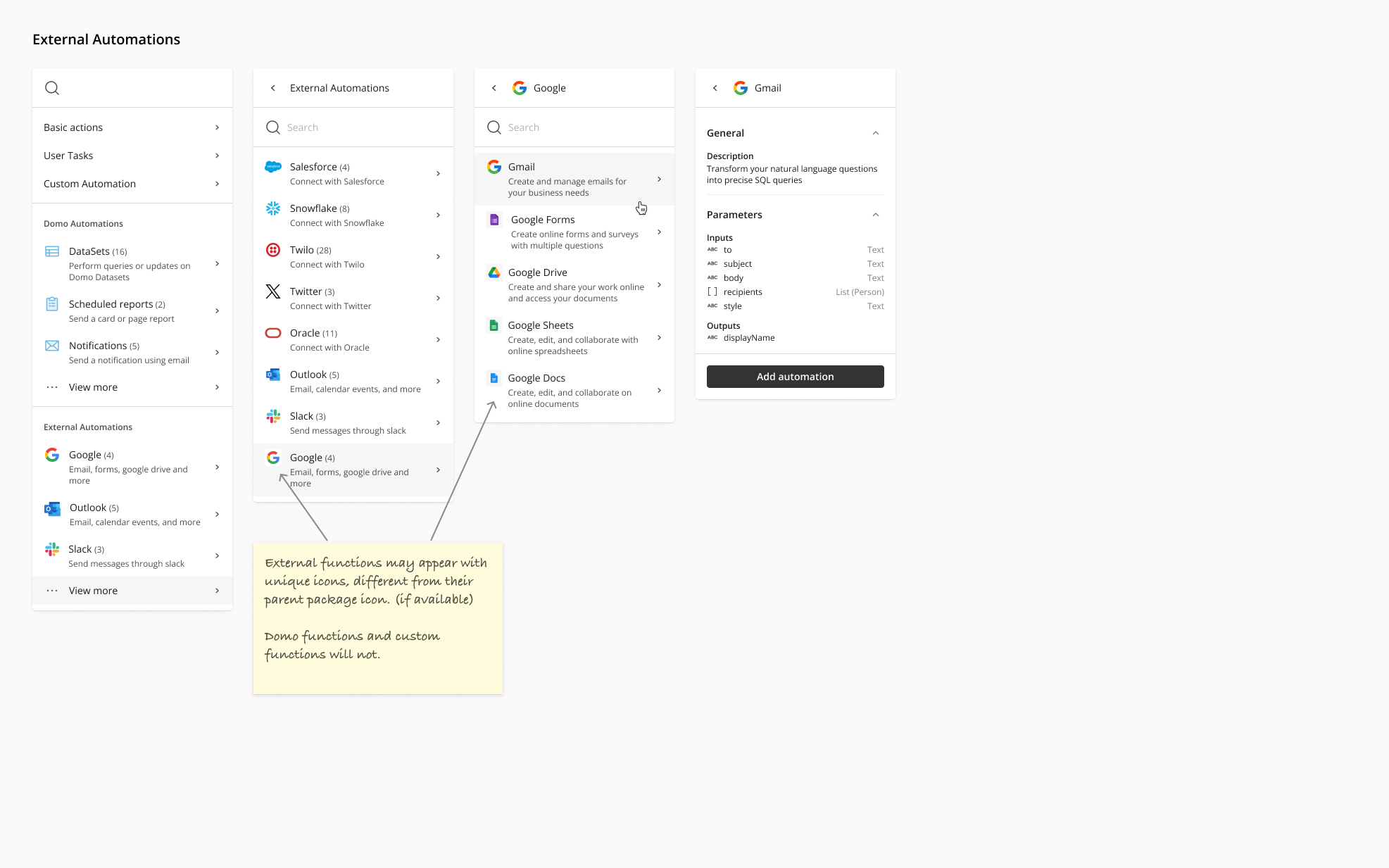
The Action Menu
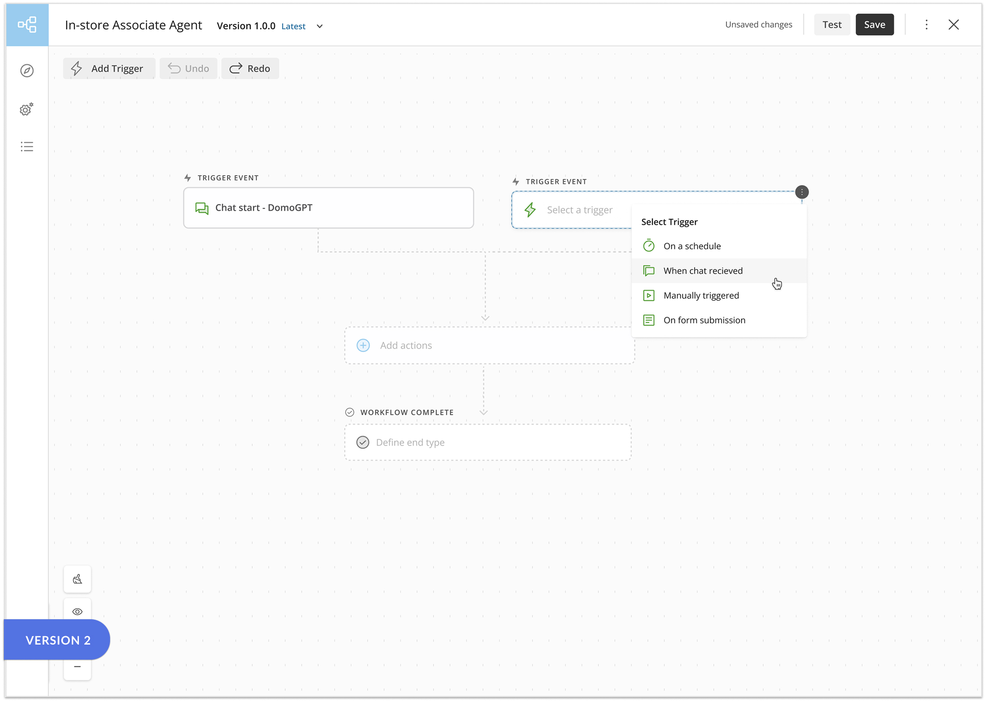
The second section was designing a new way to pull shapes onto the canvas. Previously, users
had to go to different areas of the product to access different options. My designs proposed
what we called an ‘action menu’, which provided an easy way for users to see what features
Workflows had, all in one place.
This re-design required re-organization of Workflow steps into 5 main categories: basic
actions, user tasks, custom automations, Domo automations, and external automations. I would
later suggest a further simplification once AI tools and Agents were added to the list.
Some of these changes also affected existing functionality in unexpected ways.
Features affected included connecting orphaned steps, conditional branch logic, and timer
events.

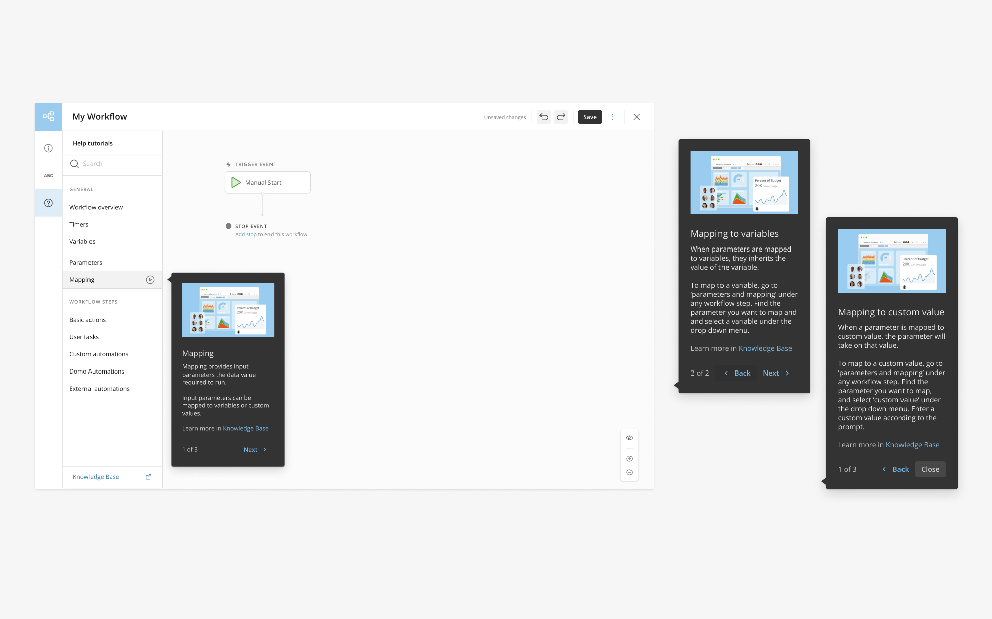
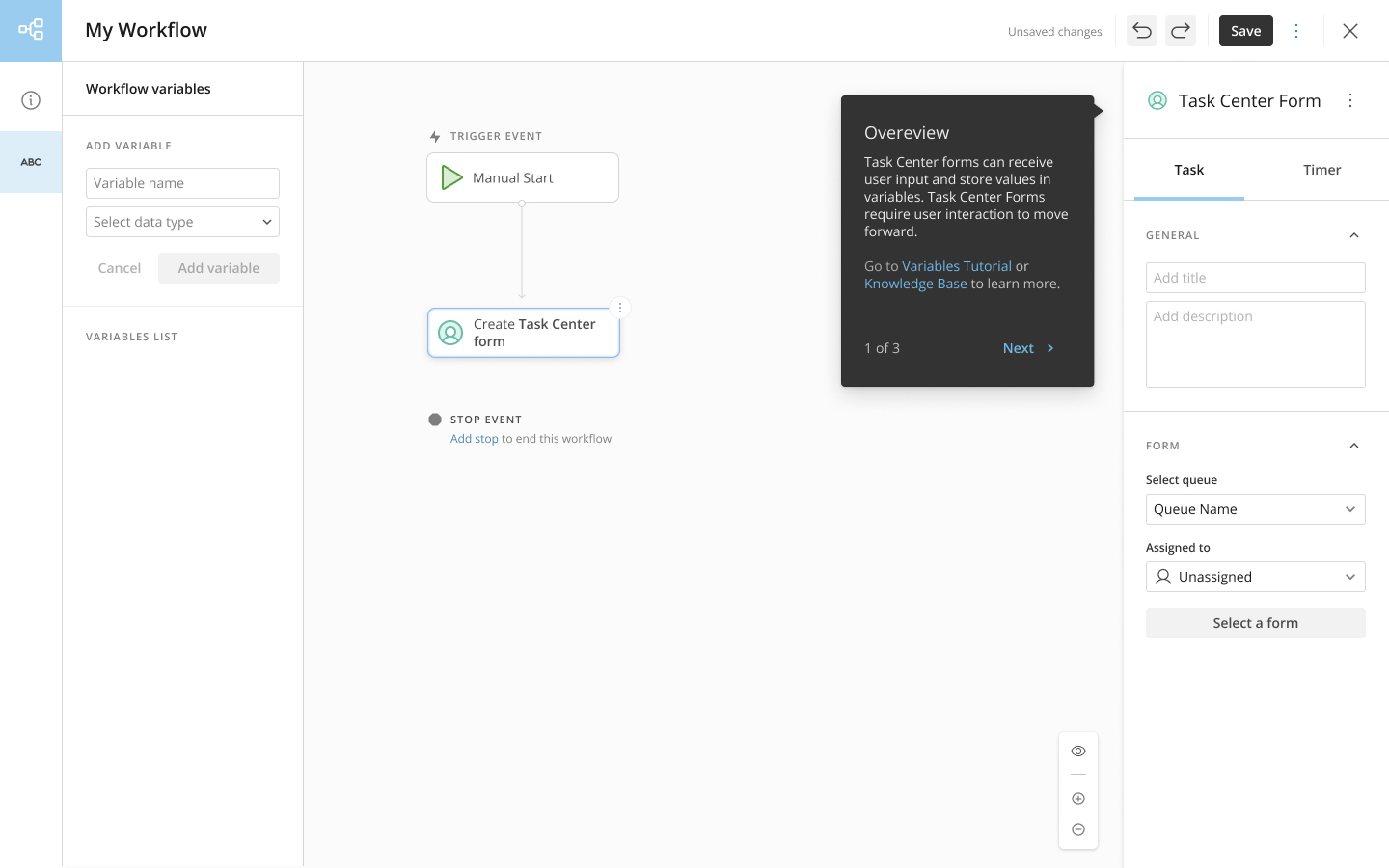
Help content
The third and final section of the re-design project was to develop help content. We had existing documentation, but it required users to leave the product entirely. I wanted to provide short, summaries of this information within the context of the Workflow builder to make it more approachable for beginner users. After spending so much time speaking to the developers and learning about the product, I felt comfortable drafting and suggesting some of this help content. Working with the developers for clarity and technical correctness, I drafted help content for each basic workflow shapes, as well as help information on what parameters and variables are and how to use them.
Conclusion
Having completed this initial re-design of Workflows, I’m keenly aware of how far there is still to go. Pushing for this re-design, however, helped a little used product gain popularity internally as well as externally. The improvements made not only improved Workflow's visual presentation, but it also enhanced it’s usability through improved navigation, consistent design patterns, and contextual help content. Workflows now has increased product support, and we are that much closer to making an intuitive, competitive product. I’m glad I took the initiative, and the opportunity, to dig in and make some real improvements.